by Gene Crawford | Nov 21, 2012 | Gallery, Portfolio
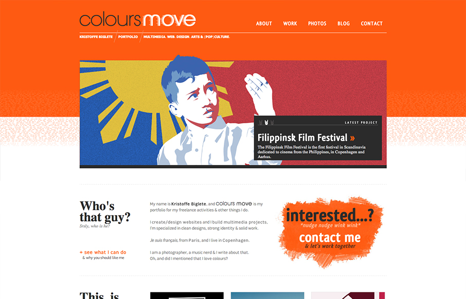
Submitted by: Kristoffe Biglete @kristoffe_ Role: Designer & Developer Colours Move is a portfolio, and has a minimalist design, with a strong visual identity. The palette is very contrasted, with a mix of bright and light colours. It is conceived in a grid...

by Gene Crawford | Nov 21, 2012 | Gallery
Submitted by: Tony Zipparro @LLTGroup Role: Designer I do like the bold graphic look of this design. The strong leaning illustration work and type works well together. They also bring it pretty well with copy and packaging themselves well. The message might be a bit...
by Gene Crawford | Nov 21, 2012 | Gallery
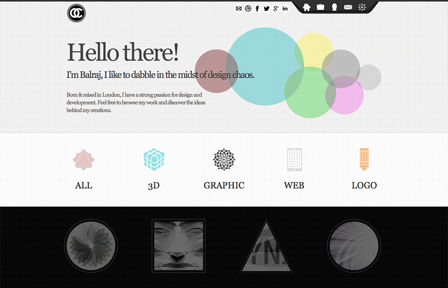
Submitted by: Balraj Chana @circularchaos Role: Designer I like how all the links and sections are presented in this design. The icons and mouse overs are nice. I also really dig the experience section towards the bottom of the page.
by Gene Crawford | Nov 20, 2012 | Gallery, Marketing
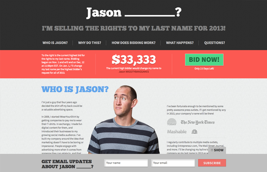
Jason is crazy. But Jason has a cool website. I like the colors most of all they’re very inviting and mixed with the imagery it works really well. Good choice on keeping it a simple one pager too. Nice!

by Gene Crawford | Nov 20, 2012 | Gallery
Nice prototypical type design but I like the minimal palette and the fixed nav interaction. Nice icons and general look and feel.

by Gene Crawford | Nov 20, 2012 | Gallery, Portfolio
This site is a great example of setting the user up for great surprises. The home page is slick but rather minimal in it’s appearance but you are treated to all sorts of cool images and a nice layout when you get to looking at the portfolio and about page(s)....