by Gene Crawford | Feb 27, 2013 | Gallery
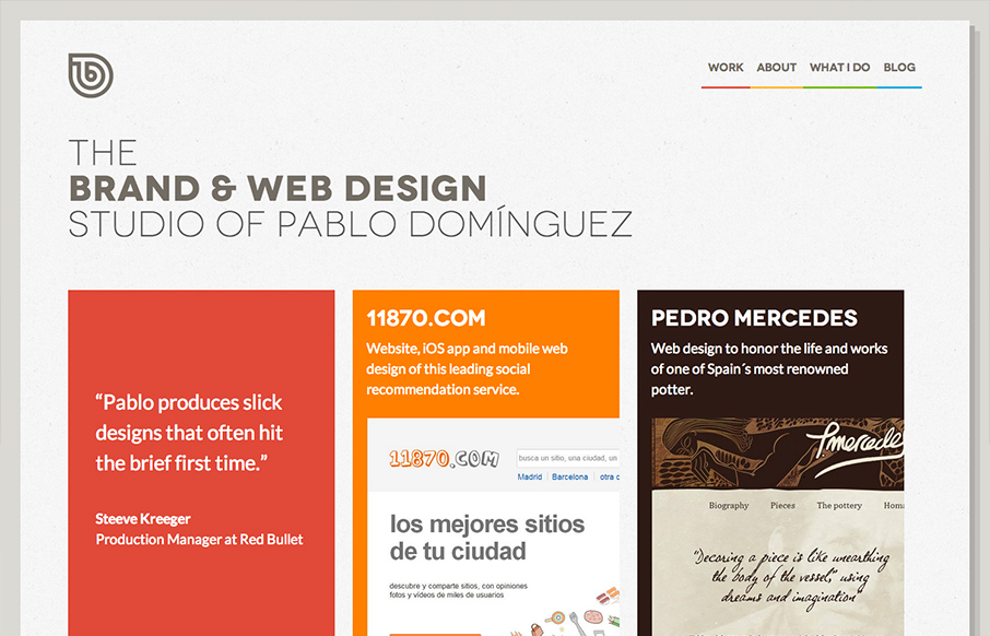
Beautiful clean and simple website. I love the hard corners and large(ish) type work. I really like how at first look the color palette looks limited but yet is very extended once you get into it. The animation in the footer area is nicely placed as well.
by Gene Crawford | Feb 27, 2013 | Draft, News, Podcast
Play or Download this Episode Download MP3 (10.58 MB / 00:11:33) Subscribe to the Show iTunes / RSS feed About this Episode In this episode of Draft we discuss side projects. We all have them, how do we make them successful and how do we use them strategically. About...

by Gene Crawford | Feb 27, 2013 | Gallery
Aside from having a really badass logo this website design is one of my favs. It’s super clean and blocky but also somehow has a nice homely feel to it. Like I can almost feel the store behind this site (not even sure it is a real brick & mortar...

by Gene Crawford | Feb 26, 2013 | Gallery
A very interesting design here with the Fly Wheel page. It’s basically a coming soon page but being so well executed it almost passes for a full on site. The illustration work and slight animation of the fixed nav and footer sections keeps it visually...
by Gene Crawford | Feb 26, 2013 | Gallery
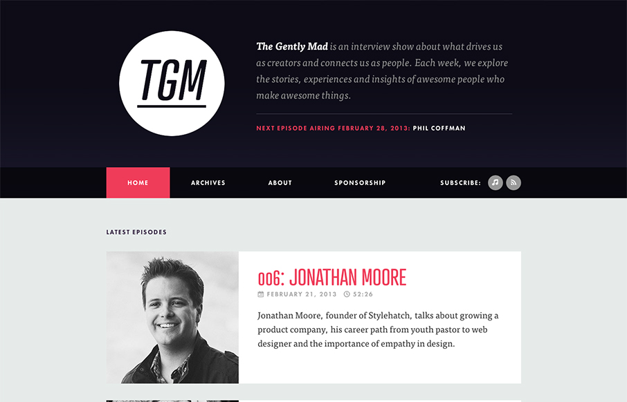
Nothing like a clean simple design that just get’s the job done right? That’s what The Gently Mad’s website does. It has a clean and simple visual brand and the site design backs it up. It just feels nice and the website just get’s out of the...
