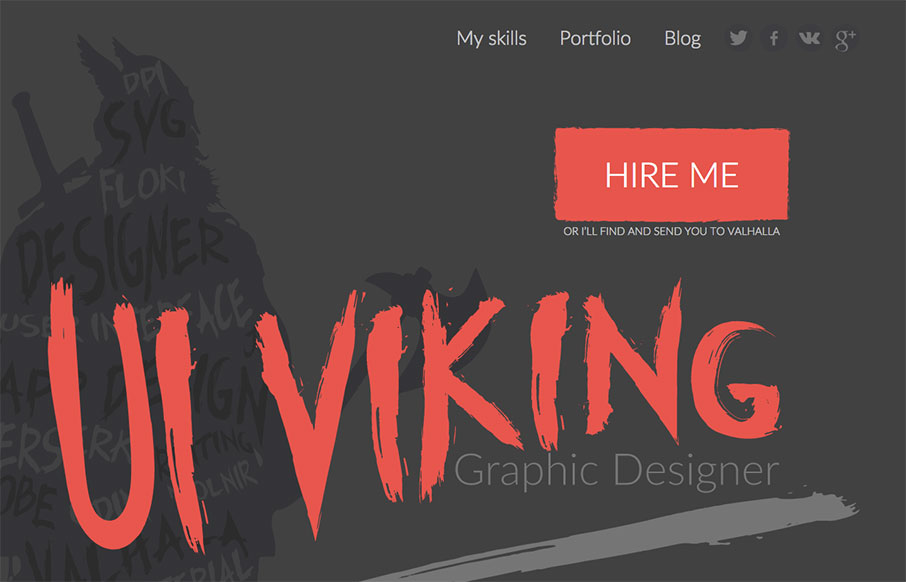
by Gene Crawford | Jan 7, 2016 | Gallery, Portfolio
This. Site. From top to bottom I love. It’s a great exercise in branding and keeping your message through every single detail. It’s also super well done and beautiful. Also, I like Vikings. Seriously, go spend time on the site and enjoy the details. From...
by Gene Crawford | Dec 30, 2015 | BizCraft, News, Podcast
Play or Download this Episode Download MP3 (41 MB / 01:02:19) Subscribe to the Show iTunes / RSS feed / Get Email Updates About the Show This is BizCraft, the podcast about the business side of web design, recorded live almost every two weeks. Your hosts are Carl...
by Gene Crawford | Dec 17, 2015 | BizCraft, News, Podcast
Play or Download this Episode Download MP3 (41 MB / 00:42:09) Subscribe to the Show iTunes / RSS feed / Get Email Updates We are now also syndicated on Stitcher. About the Show This is BizCraft, the podcast about the business side of web design, recorded live almost...
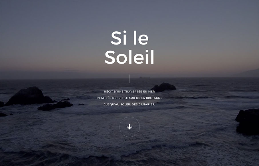
by Gene Crawford | Dec 15, 2015 | Gallery
Pretty crazy site design. I love the animated interactions and imagery and stuff. It’s also pretty rad that they were able to keep it pretty much intact on smaller mobile screen widths too. Check out that nav design too, pretty intense but super rewarding on...

by Gene Crawford | Dec 10, 2015 | Gallery
A lot of what’s on here layout wise is standard fair but it looks really nicely put together. I believe this is a theme as well, but either way take in the design for what it’s worth. Solid layout overall.