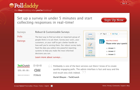
Update to the polldaddy.com website design. I’m not entirely sure when this new design went live. Interesting use of Typekit on this design in my opinion. The type selection doesn’t seem all that non-typical and feels like it could have been pulled off with a web safe font selection. I like the red a lot and the change in branding is welcome and invigorating compared to what it was. The signup page is nicely done too.
Glassmorphism: The Transparent Design Trend That Refuses to Fade
Glassmorphism brings transparency, depth, and light back into modern UI. Learn how this “frosted glass” design trend enhances hierarchy, focus, and atmosphere, plus how to implement it in CSS responsibly.


0 Comments