
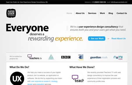
I love the chunky feeling of this site design. The three columns that make up the most of the page layout being broken in the top-most part of the site using that large type also gives it a unique feel. The use of black and white and sparing colors to focus you on specific parts of the page is also really smartly done. The sub pages are also very nice, they are all very much the same but very different at the same time. Lots of nice detail with just mostly text utilized, I love it.




There is so much going on here, no clear direction towards the essence of the site. An added eye-catcher and re-alignment of the site could make this work though.
I think I have to disagree with you Fuentes, I think the design – specifically the type in the header area drives your eye toward the “see our work” element/button.
Yes it’s text heavy but I like the spacing and think it’s opened up to be easily enough read.