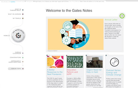
Lovely looking design on The Gates Notes. Both Jay and I love the look of this website. We do feel that the fonts are all a bit too small to be read easily. The overall design is unique and full of fine detail. Spend a couple of minutes and check out the screen cast review we did to hear all of our thoughts. But our final tally is two thumbs up on this design.
Glassmorphism: The Transparent Design Trend That Refuses to Fade
Glassmorphism brings transparency, depth, and light back into modern UI. Learn how this “frosted glass” design trend enhances hierarchy, focus, and atmosphere, plus how to implement it in CSS responsibly.


0 Comments