Submitted by Simon Young, @simon180. Designer & Developer.
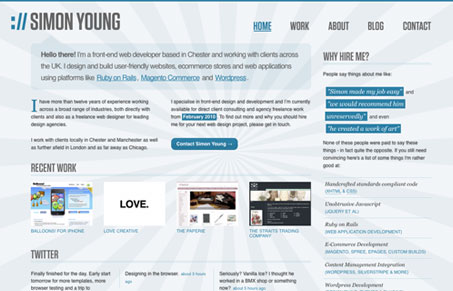
This is a realign of my personal site. Still a bit rough around the edges but very happy with it so far.
This website has a pretty interesting look. The 3 column layout, is used to the layouts advantage here with the copy going over and out and back again into each column. Good color selection too, the blue’s and grays really play well together on this design.


Solid design. Nice, subtle js touches that actually enhance the experience. Nice typography. I really hate the drop shadow on the text. It affects readability and looks blurry.
Looks good in ie8 as it does in firefox, firefox has better bits though, nicely done!
@john That’s a fair point – I wrestled for quite a while with whether to use the text-shadow or not. I’ve turned it off for the time being as I think it didn’t need an improvement to the readability.
Thanks for the feedback!