Submitted by Daniel Hellier, @danielhellier. Deisigner & Developer.
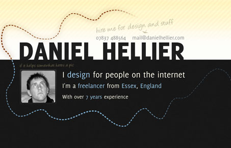
Daniel Hellier’s personal website is one of the better side scrolling designs i’ve seen in a while. Both Julia and I like this site in our screen cast review. We liked the lines that connect and pull the pages together, the portfolio is pretty nice as well. However I would personally like to see more detailed background info on each piece in the portfolio, I just always like to learn more about the designer. We both thought the copy could use some tweaking but that it was minor in comparison to the quality of the design. My favorite part of the website is the contact form design and execution.


0 Comments