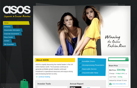
I find this design to be kind of interesting in that it’s pretty much a standard type layout but all the little elements that get blocked in with non-typical shapes. There’s some good detail work across the site and just looks finished. It’s also pretty corporate but doesn’t retain all the standard corporate trappings you come to expect in a website for something like this.
Glassmorphism: The Transparent Design Trend That Refuses to Fade
Glassmorphism brings transparency, depth, and light back into modern UI. Learn how this “frosted glass” design trend enhances hierarchy, focus, and atmosphere, plus how to implement it in CSS responsibly.


0 Comments