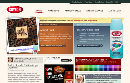
Nice type choices, good layout and some well finished looking design details make this, what could be boring, website stand out. There’s also a pretty good section on the site about color theory and trends, good resource.

Nice type choices, good layout and some well finished looking design details make this, what could be boring, website stand out. There’s also a pretty good section on the site about color theory and trends, good resource.


Your working memory holds about four things, not seven. Chunking groups loose information into meaningful units that slip past that limit, the psychology behind phone numbers, scannable pages, multi-step forms, and grouped navigation.

The Call to Action hasn’t changed in a decade, but the bar has. A fresh look at prominence, copy, mobile tap targets, and accessibility, with lessons from three major design systems.

Glassmorphism brings transparency, depth, and light back into modern UI. Learn how this “frosted glass” design trend enhances hierarchy, focus, and atmosphere, plus how to implement it in CSS responsibly.
I’ve been using Krylon spraypaint for all my graffiti lately. It’s neat to see them featured on US.
I like the site, but I think they could have done a lot more with colors on the main page – they are, after all, a company based on selling colors 🙂
Graffiti hunh?