
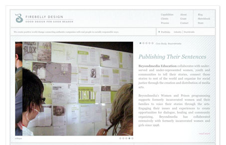
I love the subtle yet very deliberate details in this design. It’s subtle in that the colors and layout details fade back, nothing is really screaming at you, except the imagery which really sticks out. The details are all really nice and the type matches up in a way that feels smooth. I think some of it gets hard to read in places where the font is rather small and/or gray, but overall it’s a well done website.




0 Comments