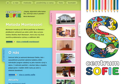
This website is very different, especially with the sideways tabs. I think it’s quite ingenious really, the sideways tabs really lead to a little exploration. To me this really plays up the montessori angle behind the school as well. The 60’s styled “S” is really well done too. In the end i’m not entirely sure just how usable a site design like this, but it sure looks fun.
Glassmorphism: The Transparent Design Trend That Refuses to Fade
Glassmorphism brings transparency, depth, and light back into modern UI. Learn how this “frosted glass” design trend enhances hierarchy, focus, and atmosphere, plus how to implement it in CSS responsibly.


0 Comments