
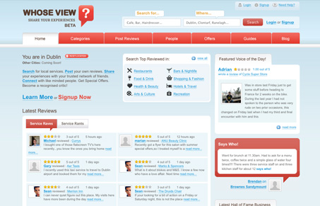
Really great, clean layout where a ton of information is used. The read really makes the interaction points stand out consistent. The header area with could have really been a train wreck has been cleverly spaced and marked. I do think that main section in the middle where the main photo winds up feels a bit jumbled, perhaps there a third color other than the red could be worked in. I say this because mostly I found myself ignoring that section’s navigation elements in favor of the things above and below it. Overall this design is easy to scan and looks good which is half the battle to building confidence with the user.


Fitts’s Law: Why the Easy Button Wins
Large, close targets are faster to hit than small, distant ones, that’s Fitts’s Law. A look at the 1954 rule behind buttons, prime and magic pixels, thumb zones, and dark patterns.


Hi there
Thank you for the vote of confidence and glad you like design. Note the structure of home page has changed in past few weeks from the image you have above. However general design remains the same.
Rgs
Mick
CEO
http://www.whoseview.ie