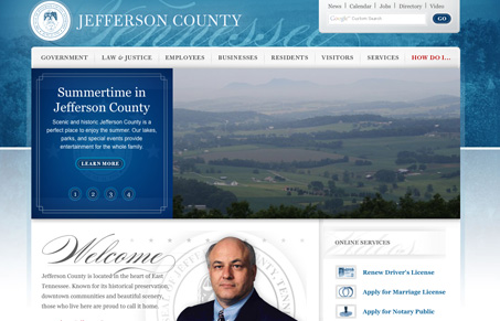
Sites for government entities or large bureaucratic organizations like this are hard to do because there is usually an enormous amount of content, mostly text, that somehow needs to be accessible to many audiences within one click. On top of that there are usually many stakeholders clamoring to get their bits of content front and center. So aside from wrangling people, organizing content is extremely important. So the end result is inevitably a home page laden with javascript hover menus. I’ve come to accept with a zen-like calm that people like these and clients always ask for them. It’s really no point in arguing that they do things like plopping the user somewhere deep in a site without knowing where they are or how to get back. Or that they have a tendency of dropping down when the user is just moving their mouse around. But I digress. The way they are handled on this site works well, and they are at least designed with some thought by not showing the whole architecture of the site underneath each link. They function more like quick links for each section. This is an improvement on the normal function of these. I can do without the fading in/out and sliding. It’s ‘fancy’ but adds nothing, and actually makes it take a split-second longer to see the content.
As far as the design, this is a really great looking site. It has a nice, distinguished look, the blues and the silvers(grays) work well with the subject matter. The slide show has some nice evocative photos that add some depth. The photo of the dude needs a title as to who this guy actually is. I assume he’s some sort of official, but it really needs to say who he is. The modal video player is a pretty nice touch, however I feel like it washed the screen in seersucker, perhaps just a solid gray background would have been better? The subpages and navigation are very well designed with a clear hierarchy that is easy to navigate. Good type treatment and spacing can make boring copy at least feel like you might want to read it. There’s a small issue on the subpage navigation, it looks like the nested lists might be too wide for it’s box or something, on the bottom near ‘Online Services’ it pushes out a little. Perhaps it’s just a minor css problem.
Website by designsensory.com, @designsensory.


Not very original if you compare it to the White House website (which was heavily inspired by the Obama campaign site). Every piece of it is a copy from the unusable dropdown navigation to the carousel. Sure, the graphics are different but every concept is a direct copy. It’s another example of a site that looks nice at a glance but there isn’t anything special about it.
Ack. Holy crap that is too much like the White House site. I’ll be honest, I thought it was familiar, but just in that “I’ve seen thousands of sites and they all blend together way.” There are definitely some differences between this and the White House site, but there are also many similarities.
To be fair to Designsensory, I would not be surprised if the client came to them and asked for something like this. Ask anyone who’s done any logo work for anything remotely political in the last year.
That’s a good point, Jay. I imagine it wasn’t too fun if the client asked that it look like that.
You’re right on the money too about the guy needing a title. I always thought it was pretty self-absorbed to slap a picture of the highest-ranking official on a site like this. That doesn’t benefit anyone except the ego of the person in the picture.
Maybe they are triying to homogenize all the sites of the U.S. Goverment?,, i dont think so, its sure that the client ask for that look.