
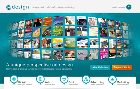
This website design manages to be very corporate and yet “independent” feeling at the same time. They show the ability to do something very visual and bold on the home page yet show the restraint to just make it a static image and not try to kill us with over the top flash. The details in the design elements across this site are top=notch. I truly enjoyed looking through this website.


Chunking: How to Design for a Brain That Can Only Hold Four Things
Your working memory holds about four things, not seven. Chunking groups loose information into meaningful units that slip past that limit, the psychology behind phone numbers, scannable pages, multi-step forms, and grouped navigation.


0 Comments