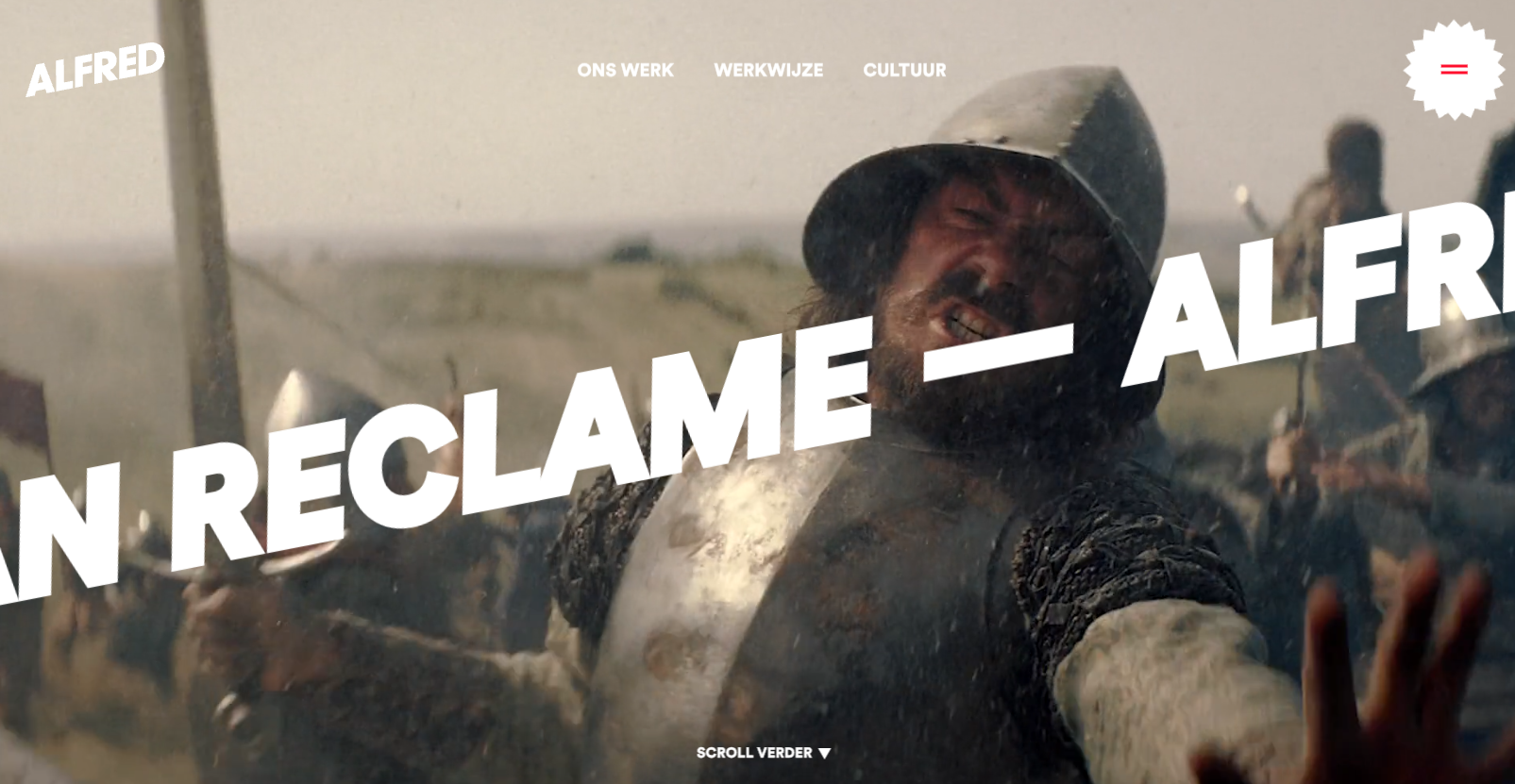
In the hero header, a bold, easily readable text layer smoothly scrolls from right to left. What stands out is the minimal word count, making reading during motion user-friendly. Moreover, this moving text layer is overlaid on an animated video roll, and the well-coordinated speed and content of both elements create a pleasing overall effect.
Glassmorphism: The Transparent Design Trend That Refuses to Fade
Glassmorphism brings transparency, depth, and light back into modern UI. Learn how this “frosted glass” design trend enhances hierarchy, focus, and atmosphere, plus how to implement it in CSS responsibly.


0 Comments