
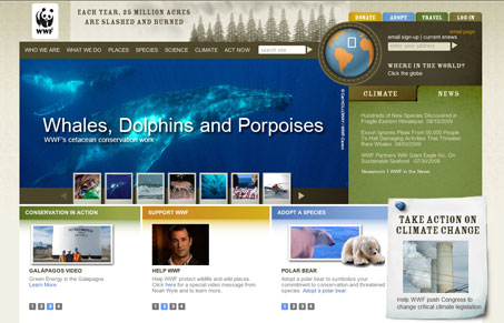
There is a ton of information designed into this home page, so I won’t go into every detail. I kind of like the “what’s inside” section, that show’s all the content in an overview format, it’s a bit overwhelming but seems well organized. The second half of the page, what’s under the “features” section seems to be the best part of the site to me. With the site map down at the bottom and grouping of things you can look at and interact with placed there. The one thing I’m left with after viewing the home page is that I have no idea what the WWF want’s me to do on the site, there isn’t a clear call-to-action that I can put my finger on. I feel like they’re missing a really big opportunity by not specifically directing me with something obvious to do.




0 Comments