thephotoargus.com

thephotoarguscom

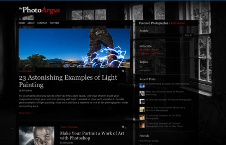
I like the background image in this design, how it’s used to frame the grid in like that, with it being a picture of a room full of windows. It really adds to the visual organization of the page layout. I also like the footer and how it uses more background imagery (the camera) to close out the site.


thephotoarguscom

I like the background image in this design, how it’s used to frame the grid in like that, with it being a picture of a room full of windows. It really adds to the visual organization of the page layout. I also like the footer and how it uses more background imagery (the camera) to close out the site.

Kinsta

0 Comments

Submit a Comment

Your email address will not be published. Required fields are marked *

Time limit exceeded. Please complete the captcha once again.

News & Articles

The Call to Action, Revisited

The Call to Action, Revisited

The Call to Action hasn’t changed in a decade, but the bar has. A fresh look at prominence, copy, mobile tap targets, and accessibility, with lessons from three major design systems.

