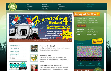
This site is fairly straight-forward and it sports quite a bit of content. I like the background image and coloring of this site. It is really well consistent across the board. I’d like to see something a little more elegant for the main navigation, it is fairly tight and simplified. I think that’s all this site is really lacking to go from being a good site to great looking site.
Glassmorphism: The Transparent Design Trend That Refuses to Fade
Glassmorphism brings transparency, depth, and light back into modern UI. Learn how this “frosted glass” design trend enhances hierarchy, focus, and atmosphere, plus how to implement it in CSS responsibly.


0 Comments