
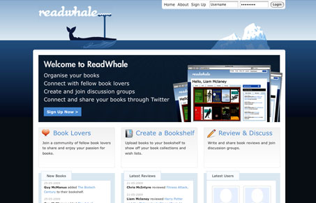
This is a nice simple look & feel. It’s really a utilitarian looking design and I kind of like that. There are some inconsistencies here and there, they could all be cleaned up to make a really nice little site/app.


Fitts’s Law: Why the Easy Button Wins
Large, close targets are faster to hit than small, distant ones, that’s Fitts’s Law. A look at the 1954 rule behind buttons, prime and magic pixels, thumb zones, and dark patterns.


Love it!
Only thing to say would be to try and keep equal padding throughout the design.