Brendly Webdesign

https://brendly.nl/

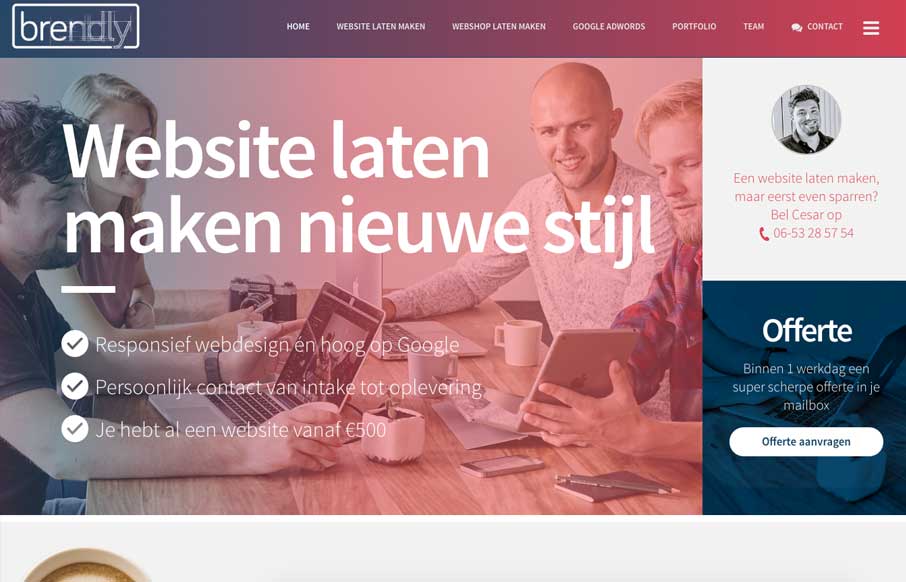
Pretty good layout, it keeps you moving your eyes around but on the right stuff. I also like how they’ve humanized certain areas like the contact us part, with a picture of one their team. Strong thinking here.

From the Designer:

We are a webdesign agency. The site features lots of custom designed elements such as a color changing menu bar, scrolling laptops and lots of subtle animations. We also encourage our iPad users to view our website in landscape with a custom overlay. The whole websites is filled with photos we had taken just for this site, which really brings it all together.

Submitted by: Cesar Zijp
Role: Designer & Developer
Country: The Netherlands

0 Comments

Submit a Comment

Your email address will not be published. Required fields are marked *

News & Articles

Sign-Up: Enhancing Conversions through good UX

Sign-Up: Enhancing Conversions through good UX

Optimize your website’s sign-up process by focusing on clarity, ease, and user mindset. Clearly explain the purpose, benefits, and steps, and use social proof to build trust and drive conversions.

The Essential Guide to Getting Started on Freelance Writing

The Essential Guide to Getting Started on Freelance Writing

Explore the lucrative and fulfilling world of freelance writing with our essential guide. Learn about specialties like blogging, social media, article, and technical writing. Build a portfolio, find work, set up your business, and discover the potential earnings. Embrace the freedom of working from home and follow tips for success in your dream career.