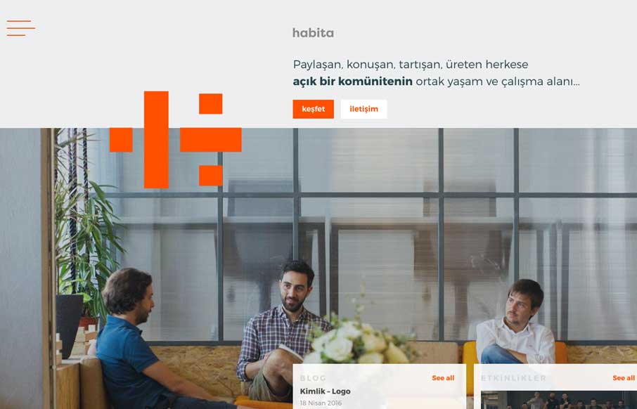
Pretty slick looking layout. My favorite part is how the logo plays off of the navigation. The fly-out nav intersects with the logo visually, then also as you scroll down the logo moves and changes a bit too. Smart work.
From the Designer:
habita is “an open & transparent coworking hub for everyone” in Istanbul, Turkey. As one of the most important acquisition channels for a coworking space, its website design should immediately show the qualities of the workspace, and the community that is growing inside it.
habita has just opened its doors, so the site should be able to grow as content (members, events, blog posts, new photos) grows. The site is built with Kirby (getkirby.com) with an API system to dynamically load in extra content.
The visual system is based on a rule of thirds: the the logo always sits on the intersection of coloured planes. The use of the theme colour orange is sparse, and is contrasted with a faded dark blue for text and secondary colour.
Submitted by: Daniel Swakman
Twitter: @ldanielswakman
Role: Designer & Developer
Country: Turkey


0 Comments