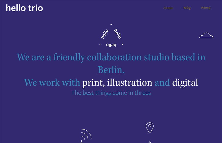
Pretty cool vibe to this site. I dig the hero area and the slight parallax/apple movement technique. I also really dig the visual break down of each section as you scroll down the page. Solid work.
Glassmorphism: The Transparent Design Trend That Refuses to Fade
Glassmorphism brings transparency, depth, and light back into modern UI. Learn how this “frosted glass” design trend enhances hierarchy, focus, and atmosphere, plus how to implement it in CSS responsibly.


0 Comments