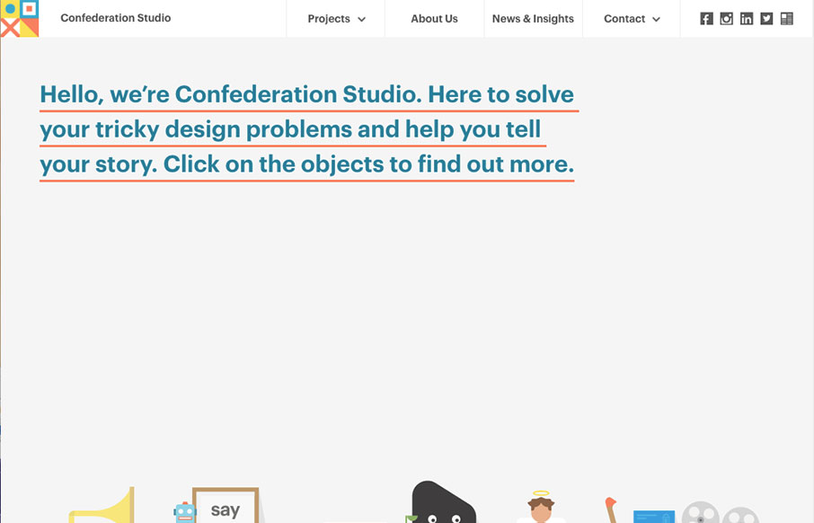
Luuurrrvvvee the simple layout approach to Confederation Studio, the thing that lands it in the cool zone is the illustration work. Really, they’re great. I love how it goes from a big hero image area to colorful blocky sections. The rhythm is strong and the mouse-overs on those sections give it just enough animation feel to make the site sing.
From the Designer:
The new site is a place where people can play with the interactive illustrations to find out more about the studio. It’s also been created to demonstrate how something interesting can be created without the use of Adobe Flash, and to inspire more ambitious digital projects.
Submitted by: Nahim Afzal
Twitter: @confedstudio
Role: Designer
Country: United Kingdom


0 Comments