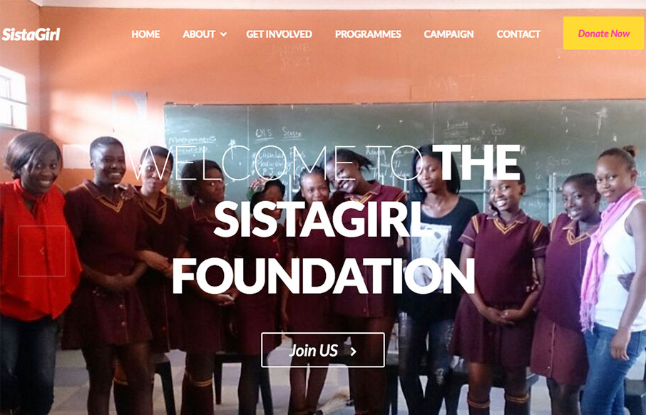
First thing I notice are the bold colors. I really like that, it’s refreshing. I also like the discreet content block sections of this site, like the “how can I help” section under the hero image area and then the double blocks of stuff under that. The vibe is nice and really plays well as you scroll the page.
From the Designer:
This is the website i had designed for woman’s empowerment in South Africa to a non profit organisation.
Submitted by: Sudharsan Ravichandiran
Twitter: @sudharsan1396
Role: Designer & Developer
Country: India


0 Comments