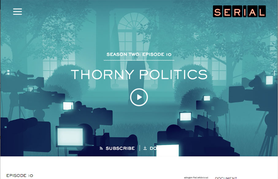
Yes – I know, I’m late to the party on Serial – I’m still in Season One, and I’m hooked! As far as the design – what first pulled me to this site was actually the podcast player – I’ve spent a lot of time on podcasts of all kinds in the past couple of months, and have seen the worst UI, and thus UX out there. So I loved the layout, how clean and sleek the player is – and how well integrated it is to the site design. Also love the detail on the illustrated video loops on Season Tw0 – and the progression of the design from season to season. No spoilers please… yeah right… not in this industry…
Glassmorphism: The Transparent Design Trend That Refuses to Fade
Glassmorphism brings transparency, depth, and light back into modern UI. Learn how this “frosted glass” design trend enhances hierarchy, focus, and atmosphere, plus how to implement it in CSS responsibly.


0 Comments