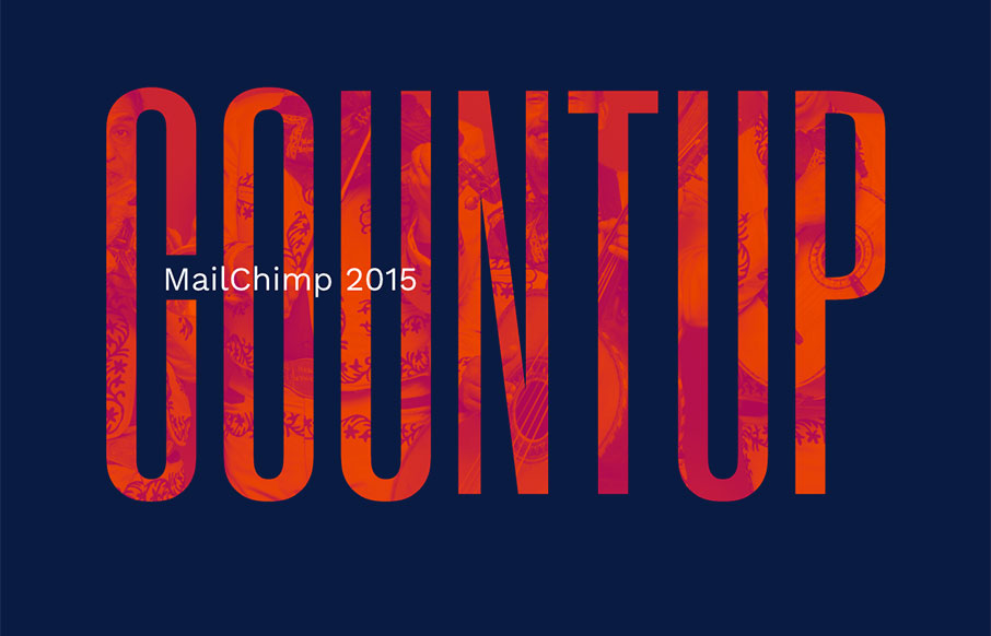
Ahhh – our friends at MailChimp have put our their 2015 Year in Review – and it’s pretty sweet! I love how it starts with the mariachi band cover of the Star Wars theme – and even though it’s a simple site, the color and vibe really speaks to MailChimp’s fun philosophy.
Glassmorphism: The Transparent Design Trend That Refuses to Fade
Glassmorphism brings transparency, depth, and light back into modern UI. Learn how this “frosted glass” design trend enhances hierarchy, focus, and atmosphere, plus how to implement it in CSS responsibly.


0 Comments