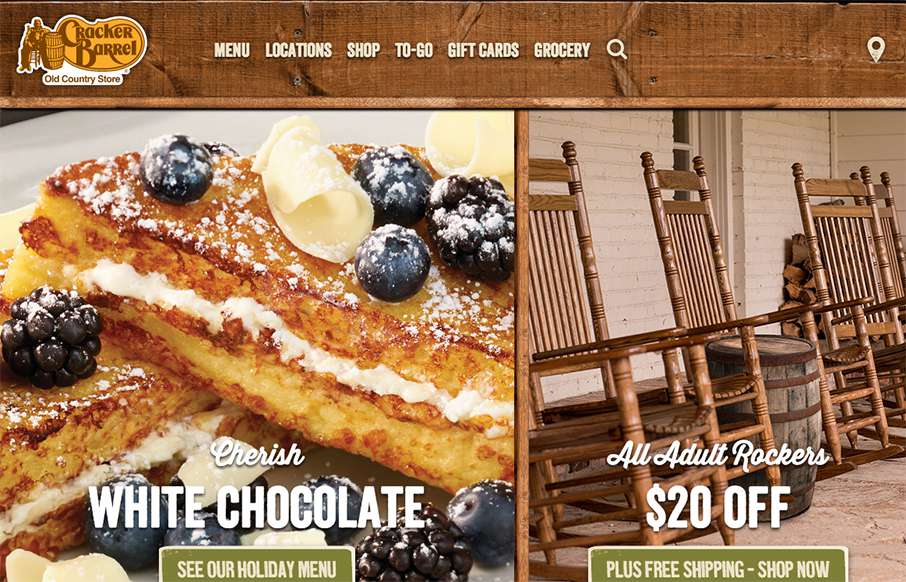
Whenever we hit the road to put on a conference (like ConvergeSE / BDConf / FrontEndDesign Conf / or Grok – shameless plugs…) you can guarantee that around 6am on the first leg of the trip, we’ll stop at a Cracker Barrel. After being in many, many Cracker Barrels – I can tell you that the website almost exactly feels like the perfect link to the brick and mortar (and wood) store. Wood paneling, tan/yellow menus, chalkboards, and tons of gravy and biscuits – great match. Was very happy to see a decent mobile version and location tracking – since I’ll bet the majority of CB’s traffic comes from there now. Ok Gene – let’s go get some brekkie now!
Glassmorphism: The Transparent Design Trend That Refuses to Fade
Glassmorphism brings transparency, depth, and light back into modern UI. Learn how this “frosted glass” design trend enhances hierarchy, focus, and atmosphere, plus how to implement it in CSS responsibly.


0 Comments