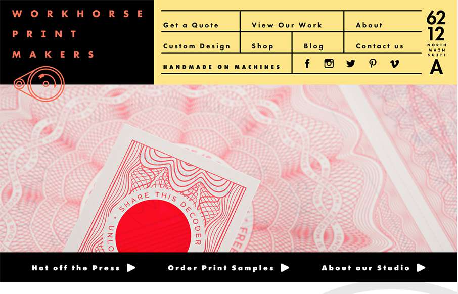
Hands down, the best navigation we’ve seen in a while in this site for Workhorse Printmakers, made by Spindletop out of Houston (think we’ve reviewed their site earlier this year too). Love this header nav block – definitely makes you think of a print house / letterpress printer – which is good, since the designer (below) was going for that. Nice!
From the Designer: Workhorse Printmakers is a partner company of ours that does full service letterpress printing and foil stamping out of Houston, TX. When redesigning their website, we had to put as much care into the site as they put into their work. The new large and open design allows the work to be front and center, while keeping the descriptions and details easy to find. On top of the new design, we focused on perfecting the small interactions and animations for a unique experience.
Submitted by: Jennifer Blanco
Twitter: @Spindletopllc
Role: Designer & Developer
Country: USA


Try hovering over the logo and illustrations at the bottom