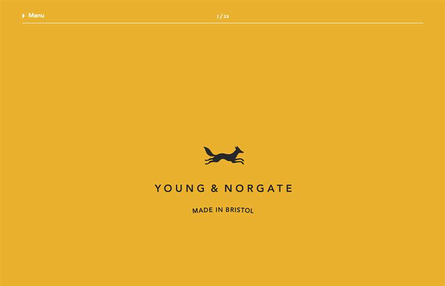
I love minimal and clean design. This site pushes it to the limit. It’s doing everything right on that side of the house. I do think it falls short a little with the nav items being set in white text, they can get lost based on the background images. However overall it does it’s job and does it well in terms of being a tool to show off the company’s work in a good light.
Glassmorphism: The Transparent Design Trend That Refuses to Fade
Glassmorphism brings transparency, depth, and light back into modern UI. Learn how this “frosted glass” design trend enhances hierarchy, focus, and atmosphere, plus how to implement it in CSS responsibly.


0 Comments