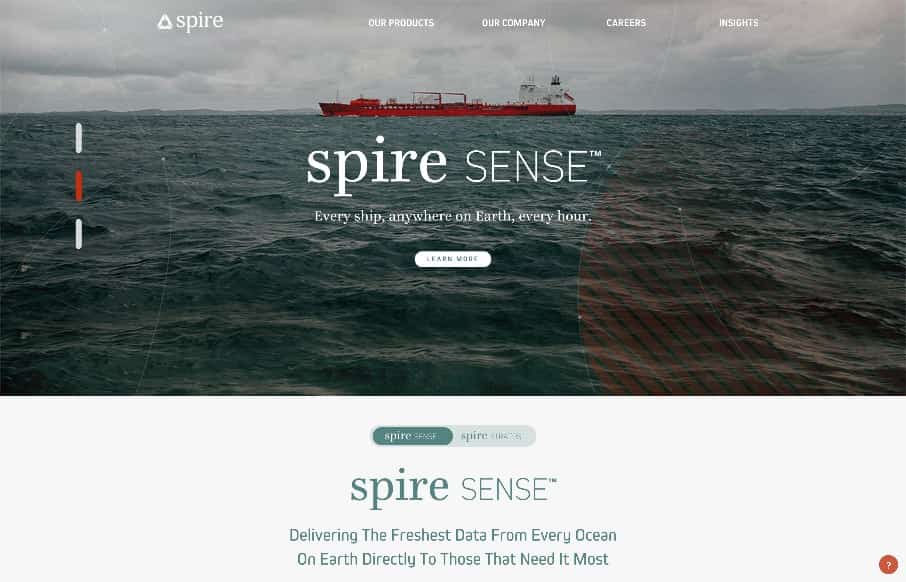
There are some really intricate interactions at play on this site. I like the little toggle areas where you can view multiple types of content in the spot on the page, as well as the side scrolling section. It plays into the target audience a bit too I believe. The website is also gorgeous visually.
Glassmorphism: The Transparent Design Trend That Refuses to Fade
Glassmorphism brings transparency, depth, and light back into modern UI. Learn how this “frosted glass” design trend enhances hierarchy, focus, and atmosphere, plus how to implement it in CSS responsibly.


0 Comments