
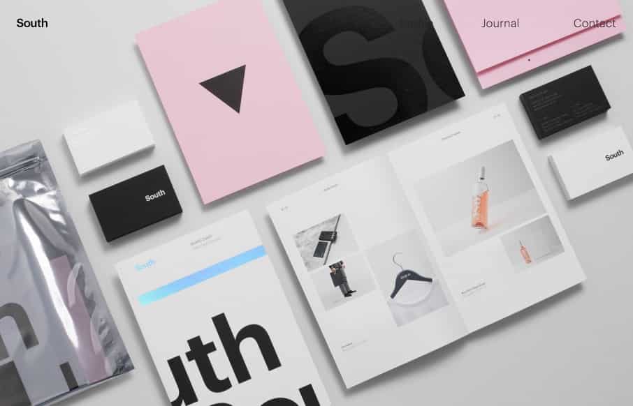
Beautifully designed minimalist website for Studio South. I love the strict grid layout and great photography of the work. Interesting approach to display the hamburger menu even though the main nav is “open” when you view it on mobile screen width.


Fitts’s Law: Why the Easy Button Wins
Large, close targets are faster to hit than small, distant ones, that’s Fitts’s Law. A look at the 1954 rule behind buttons, prime and magic pixels, thumb zones, and dark patterns.


0 Comments