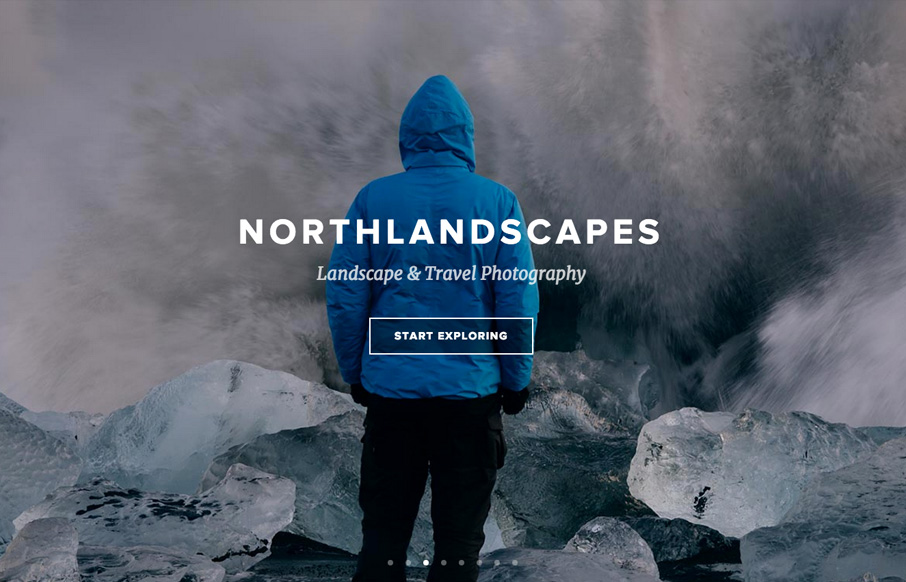
Northlandscapes

http://northlandscapes.com/

A beautiful website design, not just because of the photography though. The layout is really smart and well stacked playing well off the photography. I like the sections and how they break up well as you scroll down the page and the interactions echo the layout and are placed well within each block.

From the Designer:

I’m a webdesigner and photographer and always wanted to have a nice Single Page website for my photography business which is more focused on my work and clients instead of just showing “nice photos”. After a couple of months in photoshop and endless finetuning-sessions I came up with something I really liked.

Submitted by: Jan Erik Waider
Twitter: @JanWaider
Role: Designer
Country: Germany

0 Comments

Submit a Comment

Your email address will not be published. Required fields are marked *

News & Articles

Sign-Up: Enhancing Conversions through good UX

Sign-Up: Enhancing Conversions through good UX

Optimize your website’s sign-up process by focusing on clarity, ease, and user mindset. Clearly explain the purpose, benefits, and steps, and use social proof to build trust and drive conversions.

The Essential Guide to Getting Started on Freelance Writing

The Essential Guide to Getting Started on Freelance Writing

Explore the lucrative and fulfilling world of freelance writing with our essential guide. Learn about specialties like blogging, social media, article, and technical writing. Build a portfolio, find work, set up your business, and discover the potential earnings. Embrace the freedom of working from home and follow tips for success in your dream career.