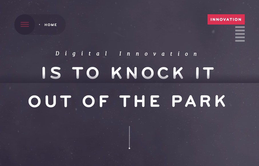
There is so much going on with the Fixed Group website that it just makes me smile. It’s a fairly simple look and feel but all the interaction and nav design leaves you really blown away. I really dig the main nav interactions a great deal. The colors and dark/muted elements give it a moody feel but it’s overlaid with some fun copy and photography.
Glassmorphism: The Transparent Design Trend That Refuses to Fade
Glassmorphism brings transparency, depth, and light back into modern UI. Learn how this “frosted glass” design trend enhances hierarchy, focus, and atmosphere, plus how to implement it in CSS responsibly.


0 Comments