
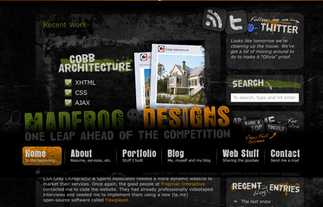
This site has all sorts of crazy stuff going on, from the static footer to the semi-transparent images it’s unique. I think there is definitely some areas of this website where users could get lost or not know what to do. Is it possible there’s too much going on with this website and what makes this different from a traditional flash based website? What do you think of the user experience of this site design?


Chunking: How to Design for a Brain That Can Only Hold Four Things
Your working memory holds about four things, not seven. Chunking groups loose information into meaningful units that slip past that limit, the psychology behind phone numbers, scannable pages, multi-step forms, and grouped navigation.


0 Comments