We see so many local websites that are just, well, not good. Our buddy Joe Lemmons @joslemmons just finished this site for the Five Points Association in Columbia, SC – and friends aside, we were pretty wowed with the work. So we decided to go a little more in-depth and pull out some of our favorite elements from the site.
We’ve done merchant association work before, and know how hard it can be to not only get a huge amount of information across to the audience of the site – but also make all the association members happy. This 2 square mile area in Columbia is extremely active since it’s right next to the University of South Carolina – so preparing for the the volume of merchants and events probably required a large amount of planning to make it scalable, and look good.
Here are a few of the parts we like:
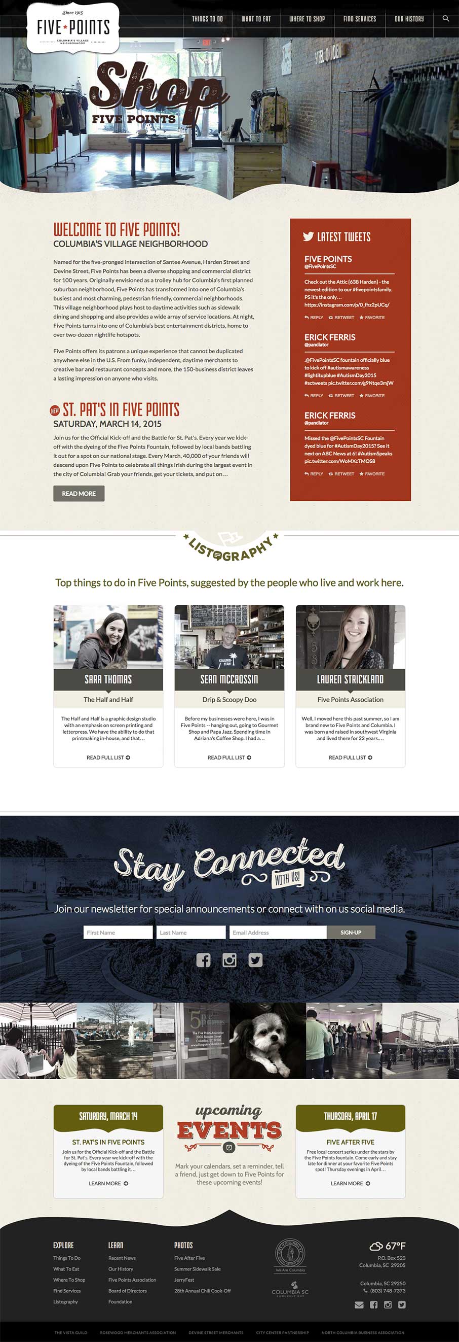
Home Page
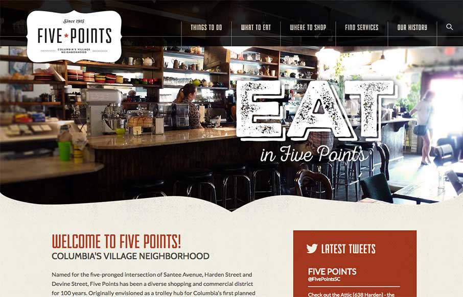
We don’t normally show entire page screen shots – but we did here because we love the overall flow of the site.
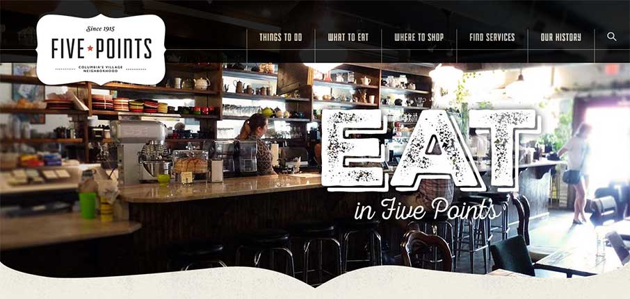
Header & Footer
Really like how the header and footer have the shaping, that even frames the slideshow on the header.

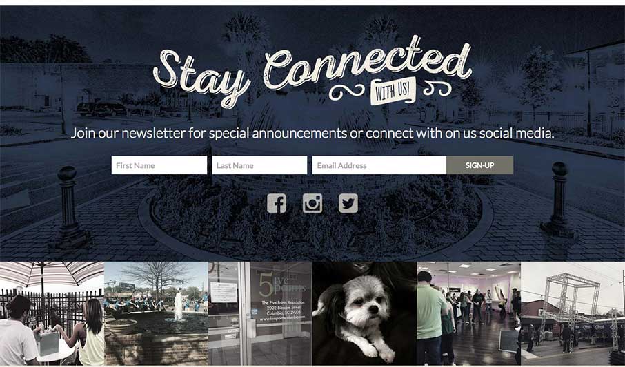
Instagram Feed and Newsletter Sign Up
You’re starting to see a lot more Instagram feeds now on sites – like this one – and like the Newsletter sign up – inviting and cool – trying to keep with the vibe of Five Points.
Listography and Detail
This is smart design, but smarter marketing.
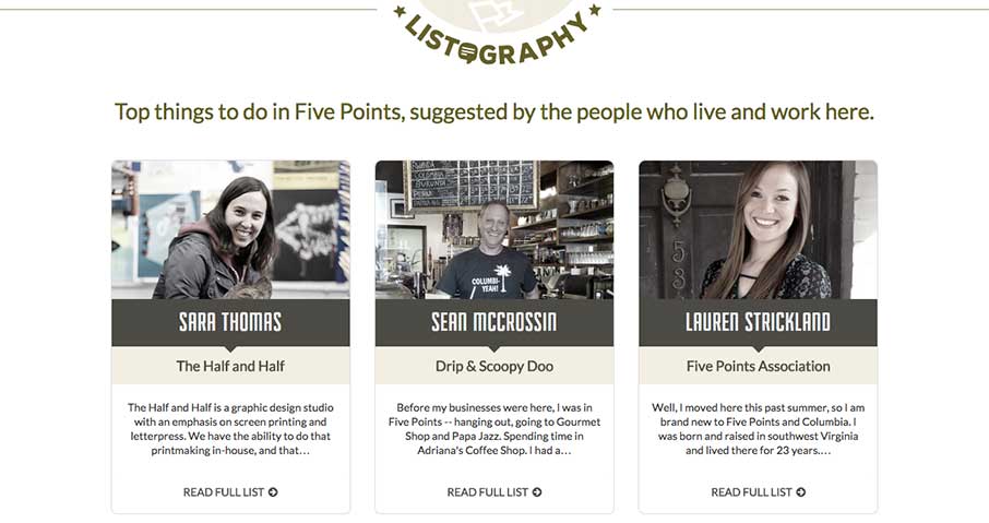
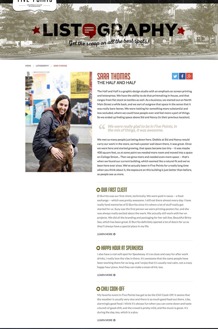
These are bios on merchants of Five Points, like our friend Sara Thomas from the Half and Half ( @TheHalfandHalf ) – that goes into story driven links to the other merchants in Five Points – a much better way to get people to explore the rest of the site.
Event Page and Detail
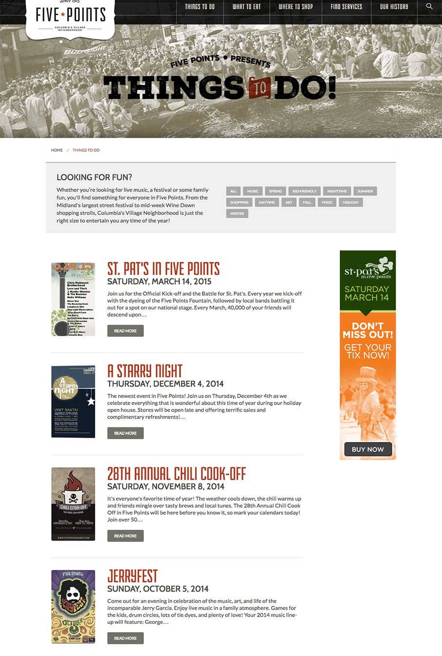
Joe does the posters for Five Points events too – like that they are showcased here in the Events feed.
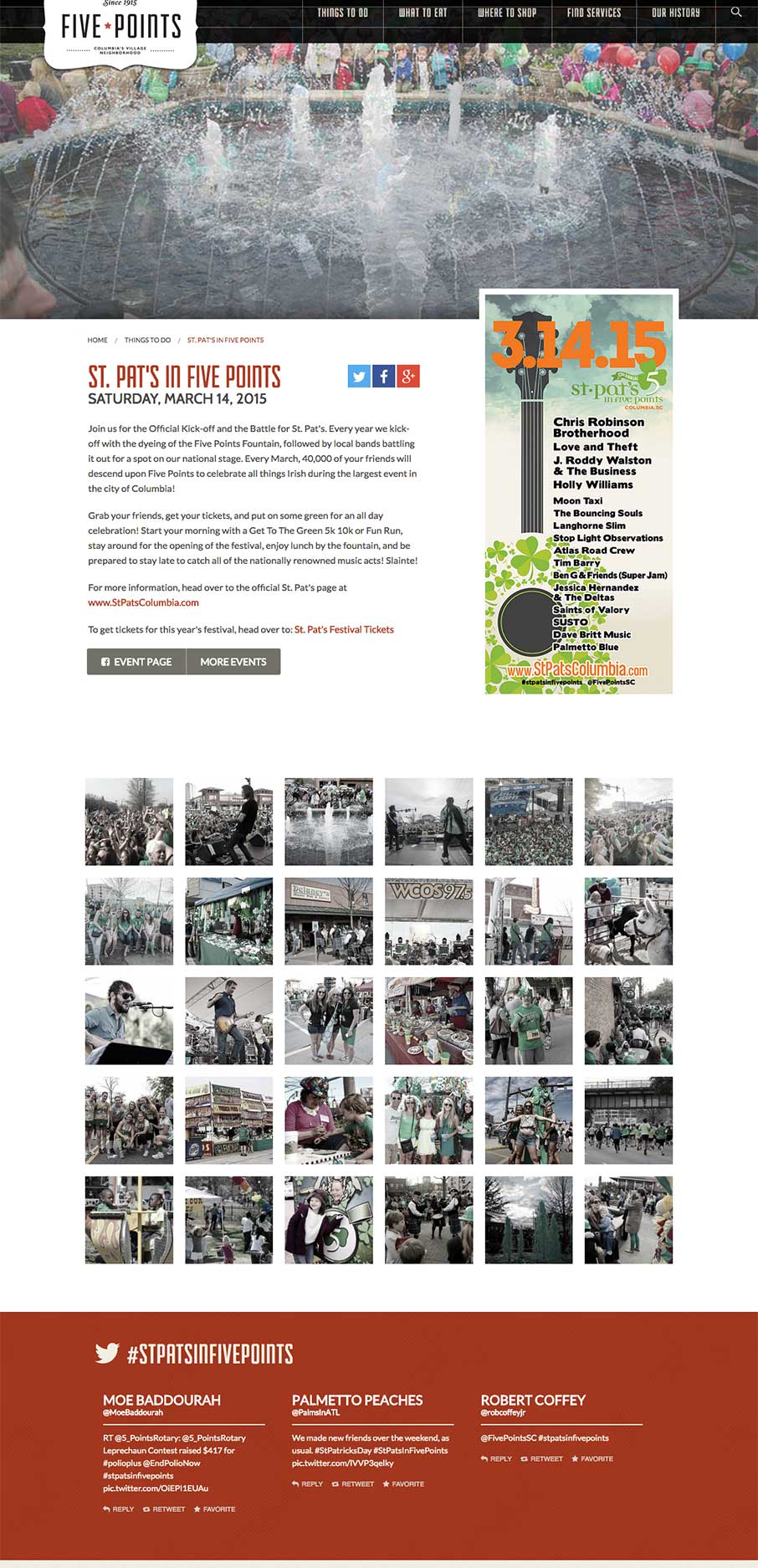
Also like the Event detail pages, how it has a little over everything (also met my wife at the St. Patty’s Day event 15 years ago – so this has a special place in my heart).
Merchant Pages and Detail
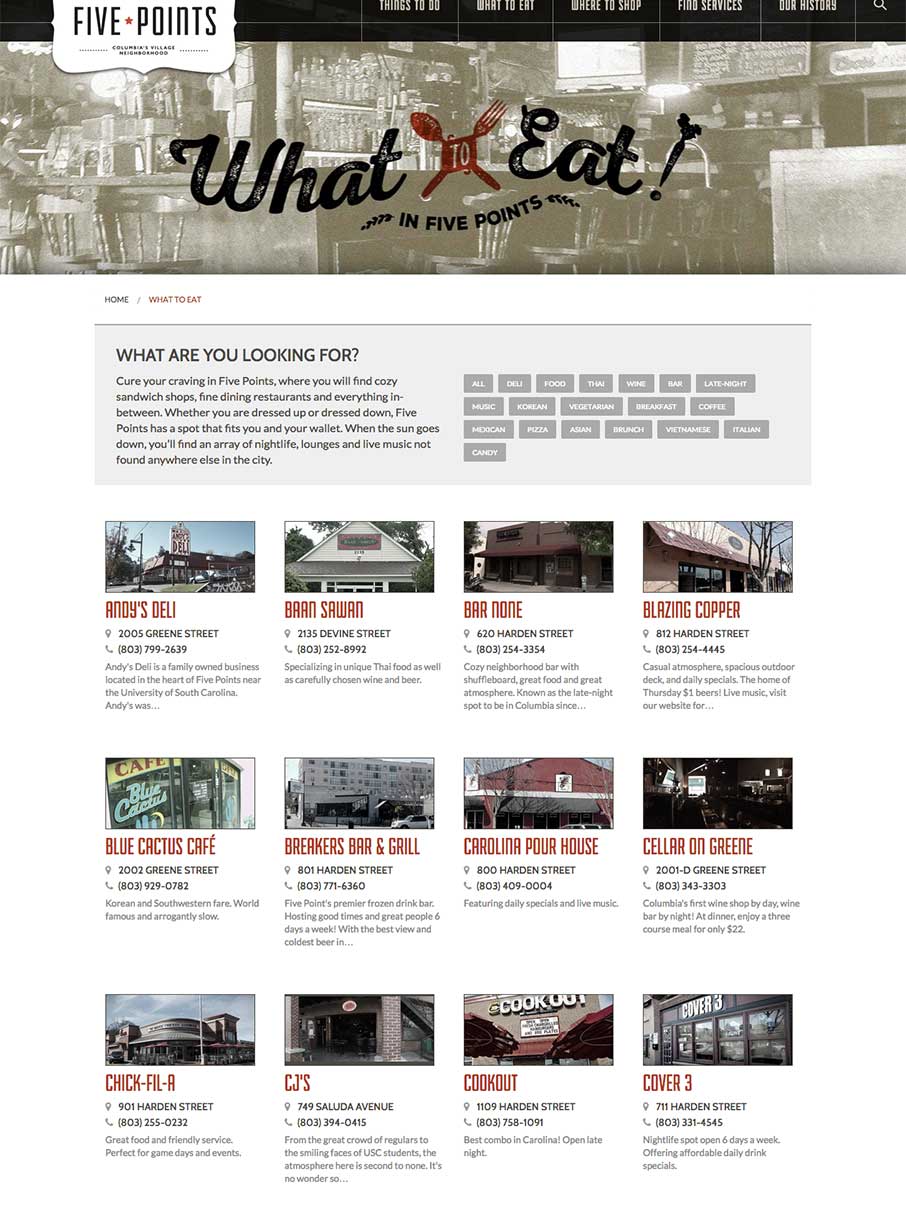
This was the only page that I struggled with design-wise, but again, how do you present 150 merchants quickly without making the page slow down with all the images, or without using jQuery masonry (which is getting to be too much of a norm).
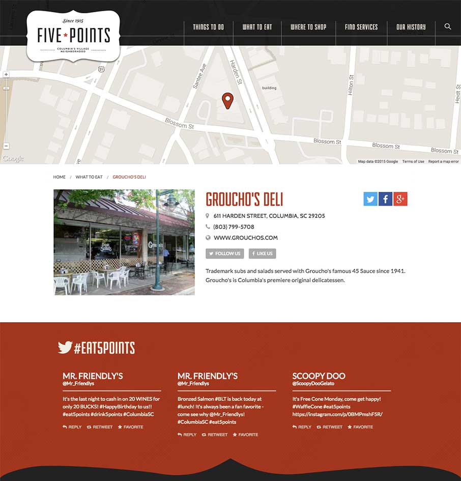
But I do love the Merchant detail pages – wish we would have done this when we did our merchant association website a few years ago. BTW – this is Groucho’s – a food institution if you ever went to the University of South Carolina.
Interested in Unmatchedstyle profiling your website in-depth? Just fill out the form – “need the info” – make sure you talk a little about the design so we can quote you. We can’t guarantee it to be fully analyzed like this one, and can’t guarantee it will get reviewed (we get a lot of requests, and try to have some standards) – but we’re making this type of long form gallery post part of our weekly editorial calendar. Let us know what you think!



Always dig Joe’s work. Love the in-depthness of this 🙂 Solid work all around