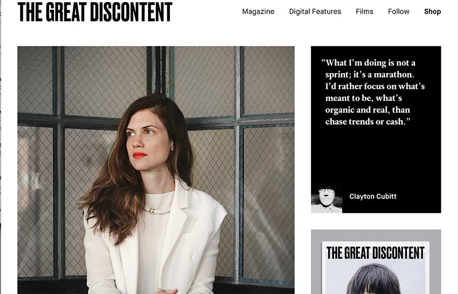
Simple, robust and impactful. Since 2011, this is how I’ve described The Great Discontent, both in its design and its quality long form articles. Every year or so they push out an [almost] invisible update to their site that seems to improve upon an experience that was, in my opinion, complete.
This time around I’m reassured by the same sentiment. It feels so refined I can’t remember what was there before.
Even though this is almost a complete redesign the biggest change that I noticed is on the homepage. Ever since I can remember TGD has pretty much always loaded directly onto their latest article. Its different now, I’m assuming in hopes to increase the engagement on older articles they’ve implemented a mosaic (ish) style that fills the page with highly engaging photographs of artists, illustrators, photographers, and quotes that link to a wealth of information. And of course, their latest issue of TGD Mag.
Overall, this iteration feels more cohesive with the publication, which is always a plus.
If you haven’t already, take some time and dive into their articles and videos I can almost guarantee you won’t be disappointed.


0 Comments