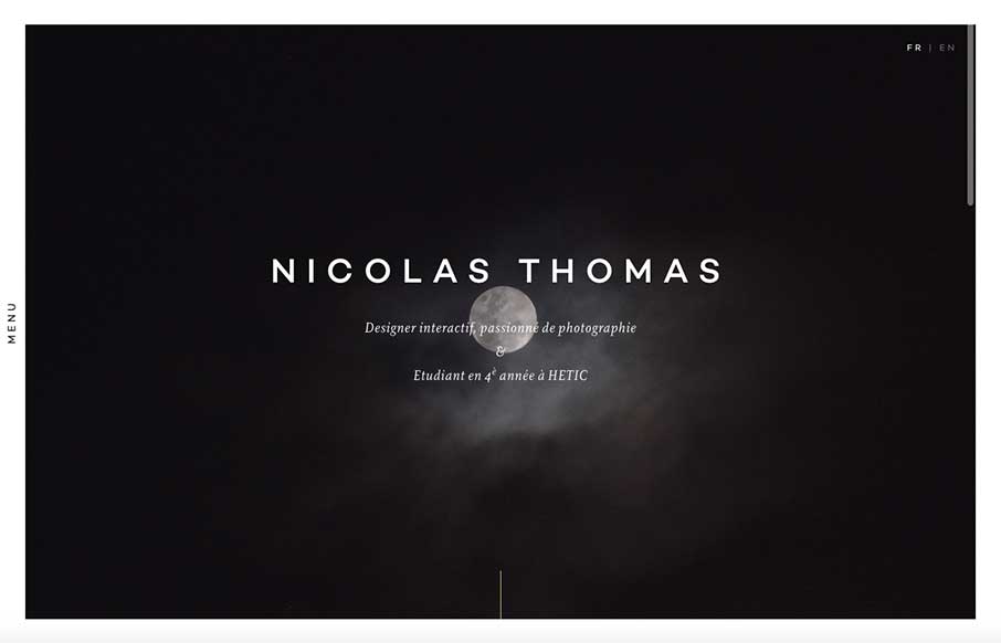
Like this portfolio site from Nicolas Thomas out of Paris. At first look, above the fold – it’s extremely crisp with the contrasting black and white of the image a copy, but the moon and cloud gives it something extra that I can’t describe right now. Have seen the borders around sites in the past year, but like that he adds the vertical / off-screen menu, that changes the border as you click on it. The work portfolio and the CV are pretty sweet too.
Glassmorphism: The Transparent Design Trend That Refuses to Fade
Glassmorphism brings transparency, depth, and light back into modern UI. Learn how this “frosted glass” design trend enhances hierarchy, focus, and atmosphere, plus how to implement it in CSS responsibly.


0 Comments