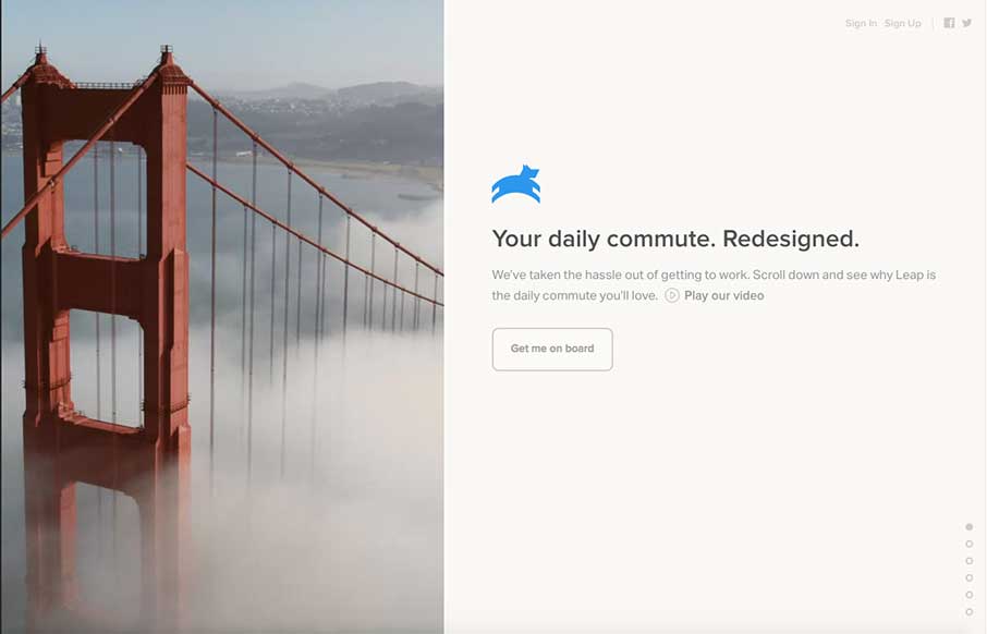
I’m going to assume that the initial pitch for Leap was “It’s like Uber – for buses.” I drive daily now, but when we lived in Sydney – I would have paid extra for this service since my commute was 45 minutes from the CBD to North Ryde where I was going to school. The site is light with a small video background and filtered images – that run perfectly with the copy – they give users a direct route to get on board…the bus… and the app… I kill me.
Glassmorphism: The Transparent Design Trend That Refuses to Fade
Glassmorphism brings transparency, depth, and light back into modern UI. Learn how this “frosted glass” design trend enhances hierarchy, focus, and atmosphere, plus how to implement it in CSS responsibly.


0 Comments