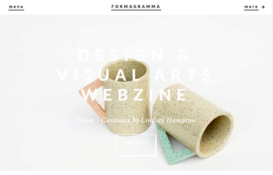
Really interesting visual approach. It has the ‘feel’ of an art or design magazine for sure. I really like the ‘view article’ overlay for the sections as you make your way past the hero area. I also like the way they’ve handled the main nav and the more nav section links. Good stuff here.
Glassmorphism: The Transparent Design Trend That Refuses to Fade
Glassmorphism brings transparency, depth, and light back into modern UI. Learn how this “frosted glass” design trend enhances hierarchy, focus, and atmosphere, plus how to implement it in CSS responsibly.


0 Comments