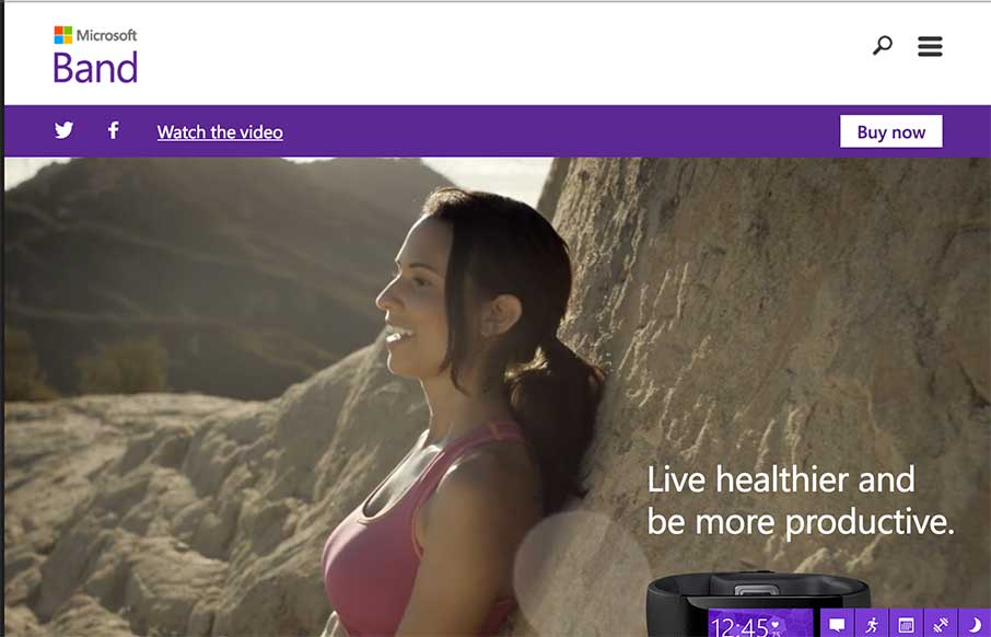
My first thought after going through this site was, “me want.” Which should be the point of a site like this. Then I remembered that I’m looking at the site for a different reason… so… basically, I had a good time on the the site – good and timely use of interactivity and video to show use and functionality of the product. I also like the vertical nav on the right – it actually feels more natural over there, and useful. And did I mention: me want…
Glassmorphism: The Transparent Design Trend That Refuses to Fade
Glassmorphism brings transparency, depth, and light back into modern UI. Learn how this “frosted glass” design trend enhances hierarchy, focus, and atmosphere, plus how to implement it in CSS responsibly.


0 Comments