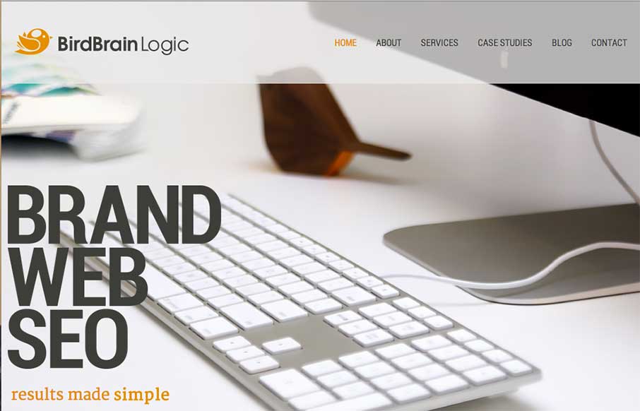
Pretty standard feeling layout but they’ve used some smooth scrolling motion in the main nav bar and other elements to make the site have a nice memorable component. I like it.
Glassmorphism: The Transparent Design Trend That Refuses to Fade
Glassmorphism brings transparency, depth, and light back into modern UI. Learn how this “frosted glass” design trend enhances hierarchy, focus, and atmosphere, plus how to implement it in CSS responsibly.


Thanks Gene, appreciate your comments- Memorable is definitely one of the things we are aiming for! @birdbrainlogic