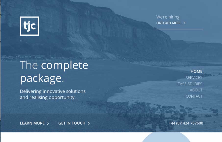
I dig the clean layout and nice use of negative space between text/design elements on this page. The minimal color palette is very business too, with the blues.


The Call to Action, Revisited
The Call to Action hasn’t changed in a decade, but the bar has. A fresh look at prominence, copy, mobile tap targets, and accessibility, with lessons from three major design systems.


Thanks so much for featuring this and for your comments 🙂