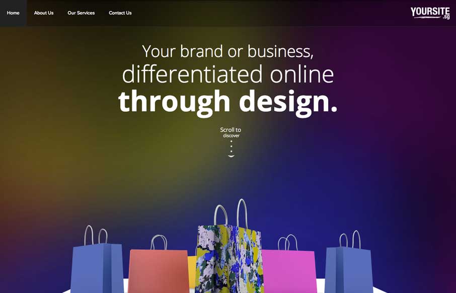
When I first looked at the site, I thought, hmm.. that’s a little too simple – one picture, no scrolling.. what gives. Then I clicked on the navigation and realized it’s a different spin on the single page website that is real trendy lately. Instead of scrolling transitions, the nav builds a little narrative, taking you precisely where the designer wanted you to go, without skipping over the content they want you to read. Add to that some crisp images and some subtle animation pieces, and you have nice and tidy client services site.


Glassmorphism: The Transparent Design Trend That Refuses to Fade
Glassmorphism brings transparency, depth, and light back into modern UI. Learn how this “frosted glass” design trend enhances hierarchy, focus, and atmosphere, plus how to implement it in CSS responsibly.


0 Comments