
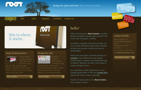
Pretty interesting design. I like the logo and the navigation treatment is neat looking. I’m not too hip on the dark brown background and the footer area is kind of odd (that text doesn’t appear to be links and it’s on each page.) All in all, this is a decent website design that should serve them well.


Fitts’s Law: Why the Easy Button Wins
Large, close targets are faster to hit than small, distant ones, that’s Fitts’s Law. A look at the 1954 rule behind buttons, prime and magic pixels, thumb zones, and dark patterns.


I don’t know, this website doesn’t feel like it’s quite finished. It’s got a decent layout and all, but there are no details that really ‘finish’ it. It just has a bit of a concept, root, tree, earth… I get it, and that’s about it. Plus, the word ‘bespoke’ always throws me.
The portfolio section seems a bit weak too, I don’t like macro shots of work like that, let me see the whole thing please…
Thanks for the comments, we’ve taken them onboard and we’ll definitely look at enhancing a few areas. Cheers.