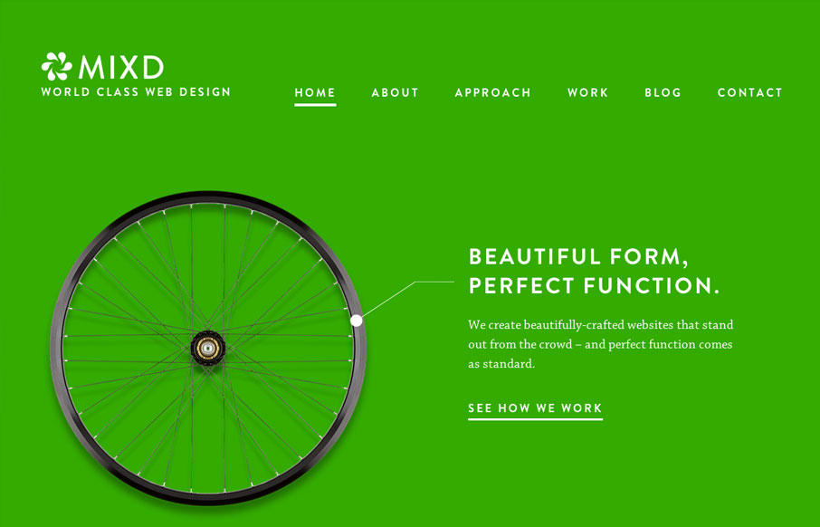
This site shows the agency’s design philosophy by comparing their online design work to simple, functional, perfectly designed offline products. Sometimes the simplest ideas are the best.
This concept is reinforced through the website by using bold, strong colours, an elegant combination of “Brandon Grotesque” and “Chaparral” and generous amounts of space. The design itself feels like a classic.
There are also some delightfully subtle interactions such as the way images are faded in as you scroll down some of the pages and the way the heart pulses on the “Approach” page.
Responsively, the layouts are quite simple on large screens so they translate well on smaller screens. There is one “glitch” where the main navigation runs into the logo at a certain screen width. Another improvement would be to consider vertical media queries to re-arrange the content for screens that aren’t so high.
Overall a very well executed stunning design.


0 Comments