
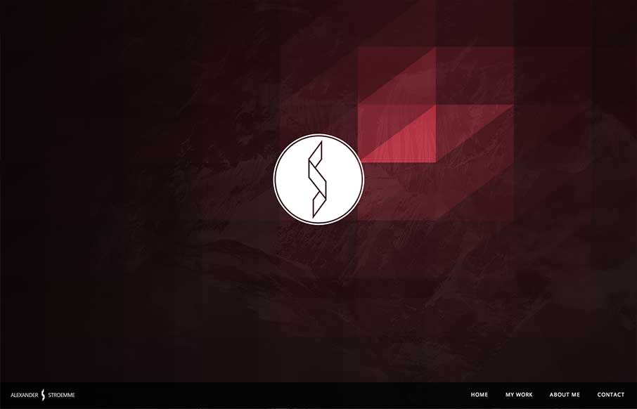
I’m seeing a few new design trends like this one, where there’s basically a splash page but it’s executed as an oversized header area. Pretty clever, like this one, which reminds me of a cylon’s eye for some reason. That alone is enough to make me like it, but it’s also got some nifty interactions over the portfolio examples and is a pretty good example of keeping things responsive. Dig it.


Fitts’s Law: Why the Easy Button Wins
Large, close targets are faster to hit than small, distant ones, that’s Fitts’s Law. A look at the 1954 rule behind buttons, prime and magic pixels, thumb zones, and dark patterns.


0 Comments