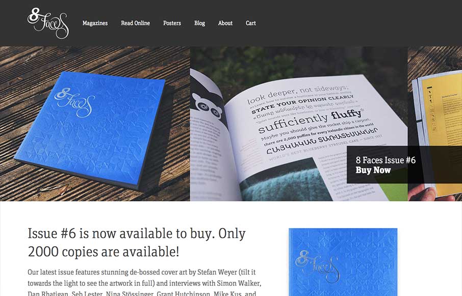
The whole point and appeal of 8 Faces is the tactile, printed objects that they produce, so much so that the website might seem like an afterthought regardless of how well it’s designed. Luckily it’s a great example of simple, effective design. The purpose is to sell issues of the magazine and show off why through evocative copy and photography, and it does that well. The ‘Buy Now’ button manages to be the largest and boldest text on the screen without overpowering anything else.


The Call to Action, Revisited
The Call to Action hasn’t changed in a decade, but the bar has. A fresh look at prominence, copy, mobile tap targets, and accessibility, with lessons from three major design systems.


0 Comments