
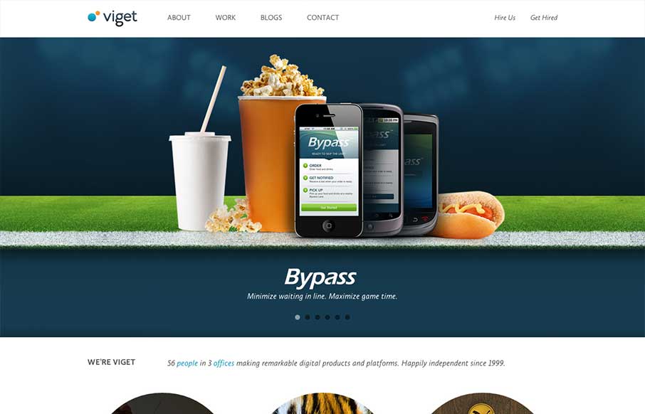
There is a lot of good looking design scattered across this website. Each page looks like it has had the same amount of love and attention paid to it as the home page has. I love it when I come across a site design like that, that’s so thorough and finished feeling. On the home page my favorite aspect of the design is the progression as you make your way scrolling from top to bottom, the circular graphics and then the boxes provide a nice dynamic look to the layout and keeps it interesting. There’s something like that on just about every page too. Love it.


Fitts’s Law: Why the Easy Button Wins
Large, close targets are faster to hit than small, distant ones, that’s Fitts’s Law. A look at the 1954 rule behind buttons, prime and magic pixels, thumb zones, and dark patterns.


0 Comments