
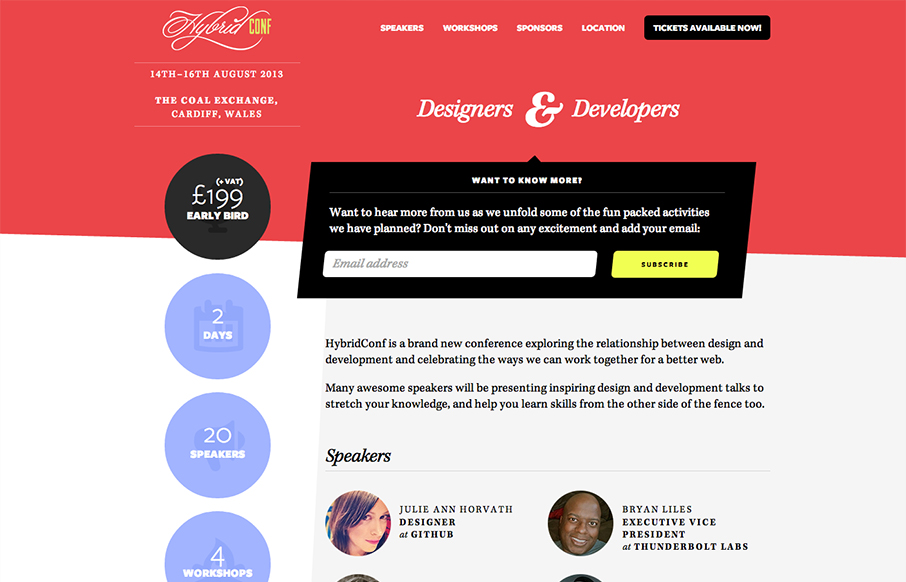
Beautiful asymmetrical design here for the Hybrid Conf website. I love it when simple design solutions wind up having such great dynamic results. The offset sidebar with the rounded profile pics just set the whole thing off right. I like the big subscribe box and the slightly off line that runs down the page to highlight the purposeful off-ness of the design. Lovely.


Fitts’s Law: Why the Easy Button Wins
Large, close targets are faster to hit than small, distant ones, that’s Fitts’s Law. A look at the 1954 rule behind buttons, prime and magic pixels, thumb zones, and dark patterns.


0 Comments